SERIOUSLY HAPPY
CLIENT
Proprint Services
AGENCY
The Creative Collective
ROLE
Design Lead – Creative Direction and Design
SCOPE
Brand Strategy
Creative Direction
Visual Identity
Expression System
Brand Guidelines
Website Design
Social Media
Marketing Collateral
Presentation Design
Motion Direction & Storyboarding
Art Direction
COLLABORATORS
Motion Design : Jay Smith
Photography: Naomi Finaly
CONTEXT
Though widely recognized for POP display, Proprint needed to broaden perceptions and cement their capabilities as a full-service solutions partner.
A complete visual overhaul was key to establishing their new positioning.
STRATEGY
Focus on their strengths and distinct value: trusted, approachable problem-solvers whose expertise extends beyond their craft by delivering thoughtful alternatives and inventive solutions.
SOLUTION
Seriously Happy was the springboard for a new identity and launch campaign, uniting two contrasting qualities: speed, precision, and technical accuracy with a genuinely friendly, human service ethos.
VISUAL IDENTITY
A New Logo
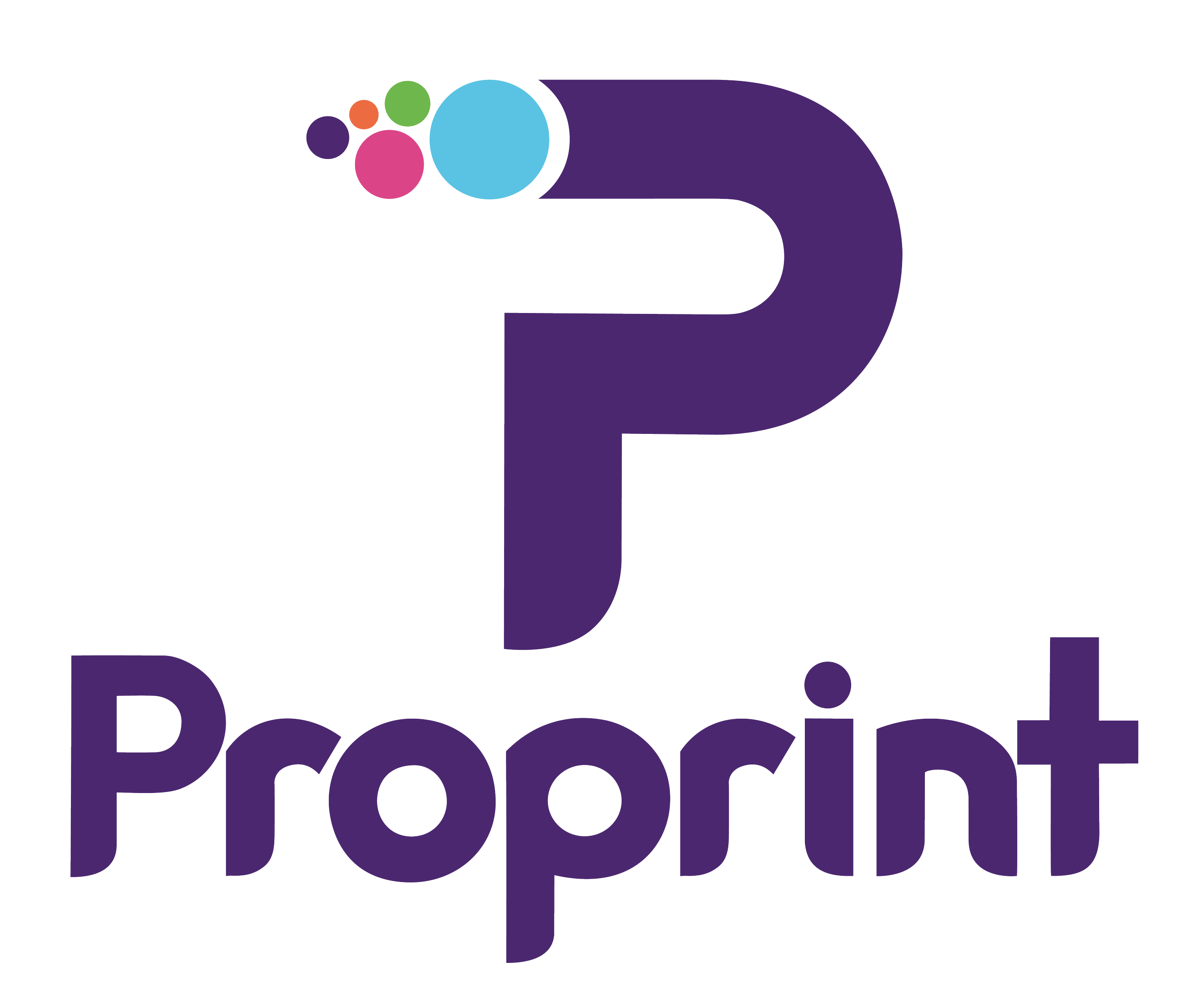
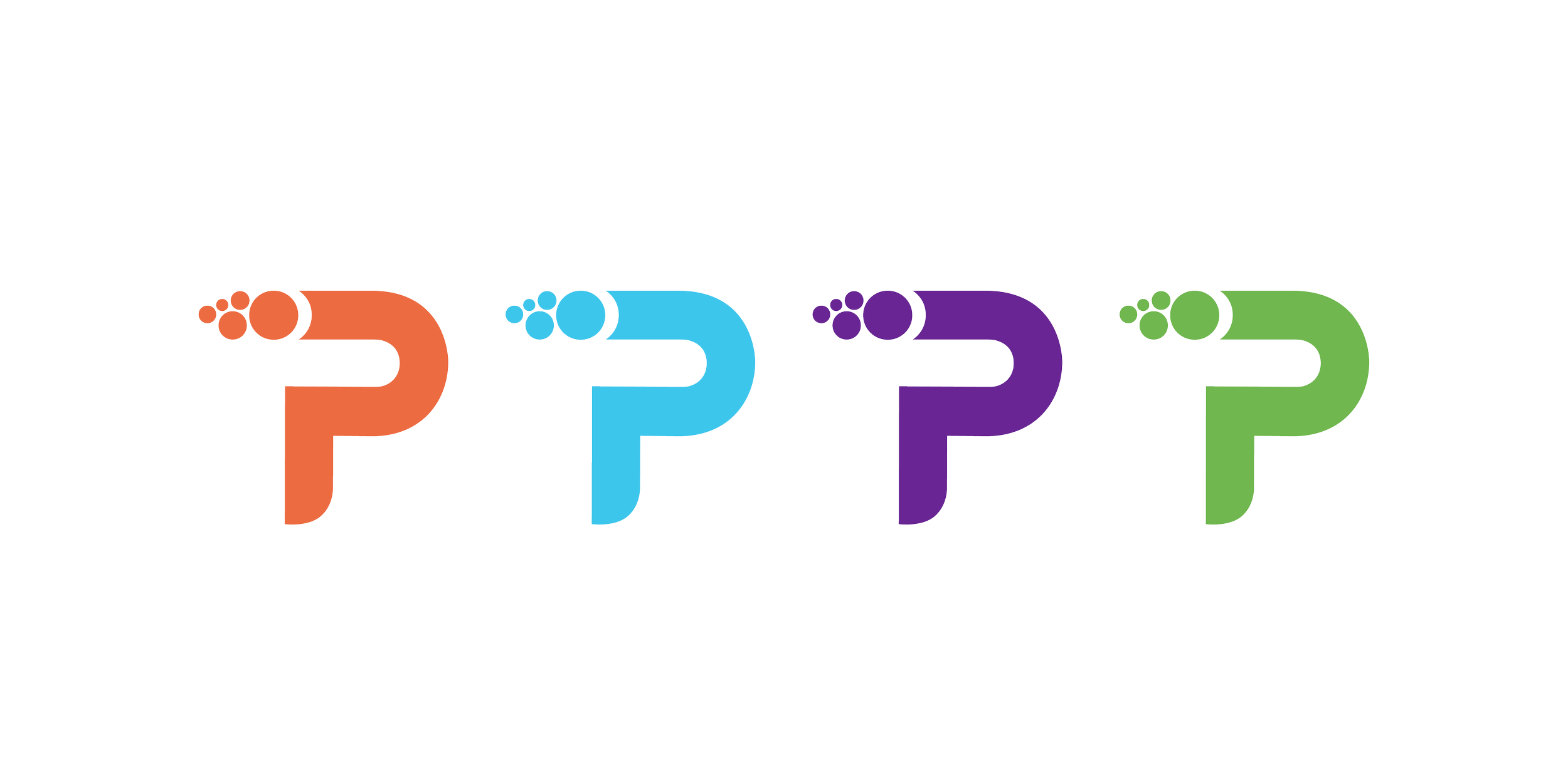
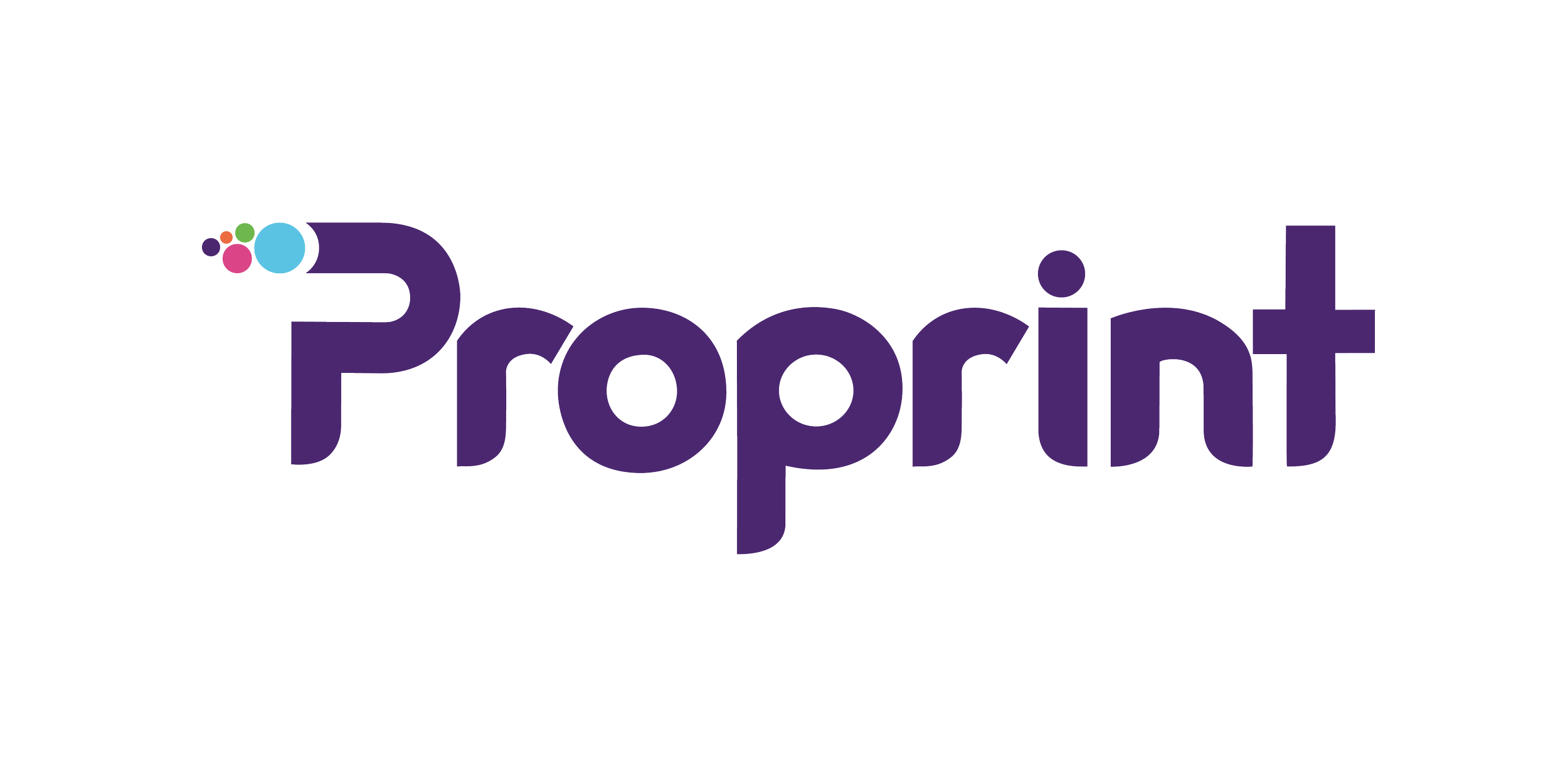
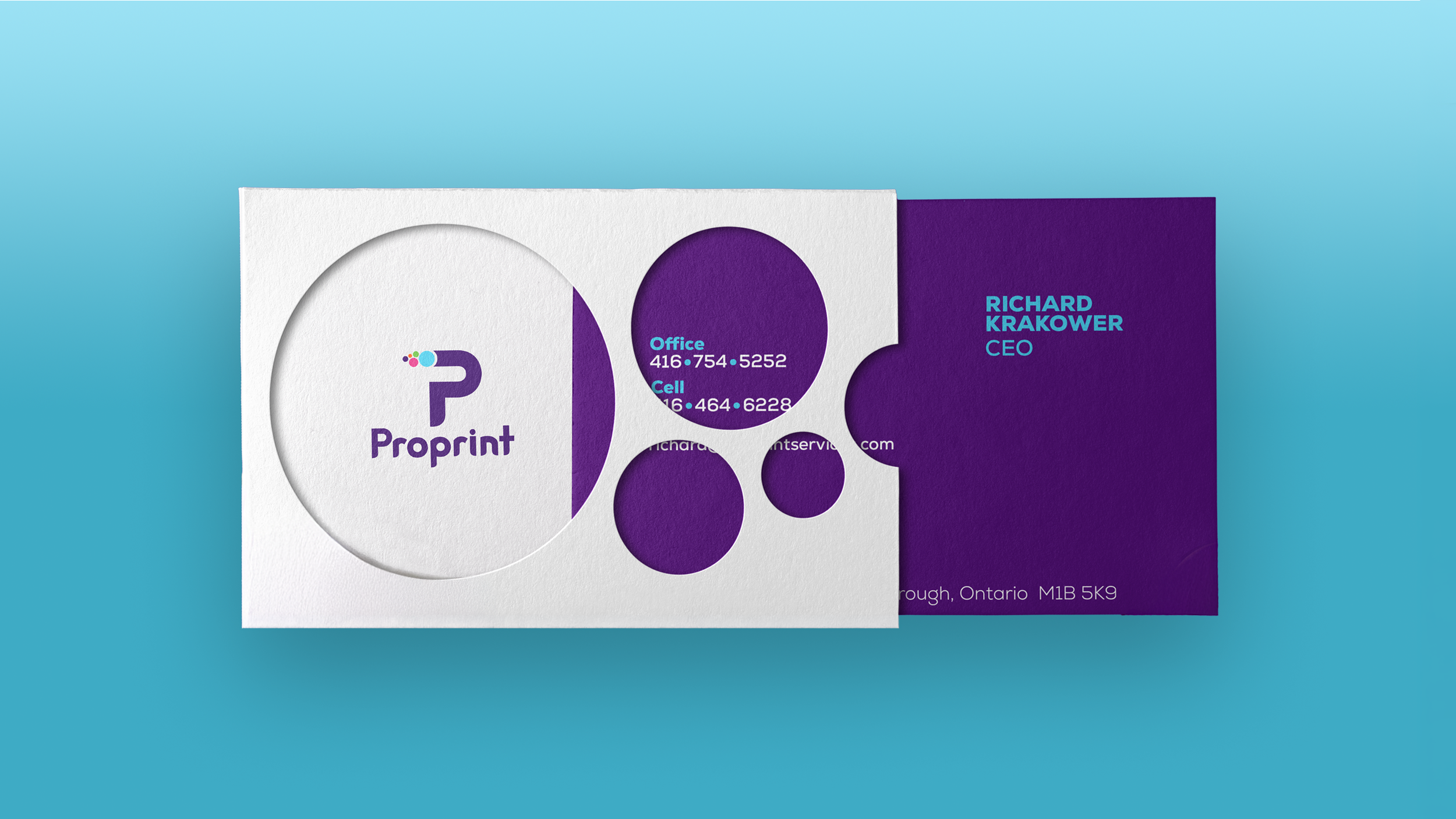
The dot motif in the new bespoke “P” and corresponding wordmark reference the printing process—an element the team was keen to retain from the original wordmark.
The new arrangement suggests movement, speed, and forward momentum—reflecting both the pace of the business and its forward-looking approach.
BRAND EXPRESSION
Design in Motion
Key messaging and visual elements play well together for engaging short- and long-form video content.
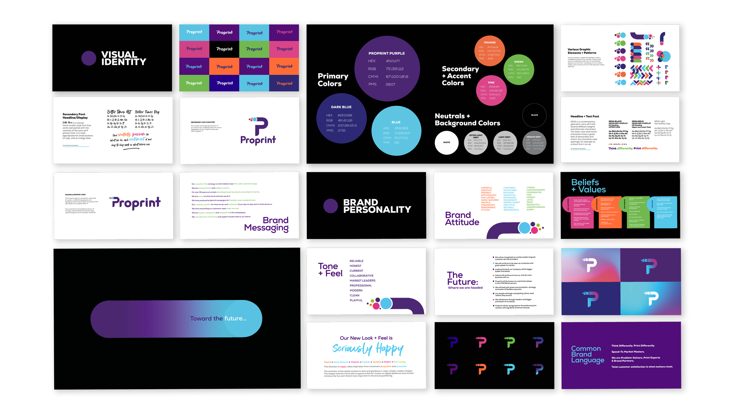
A black backdrop anchors the vibrant colour palette, while a secondary handwritten script introduces a casual, optimistic tone—reinforcing the brand’s personal, approachable character.
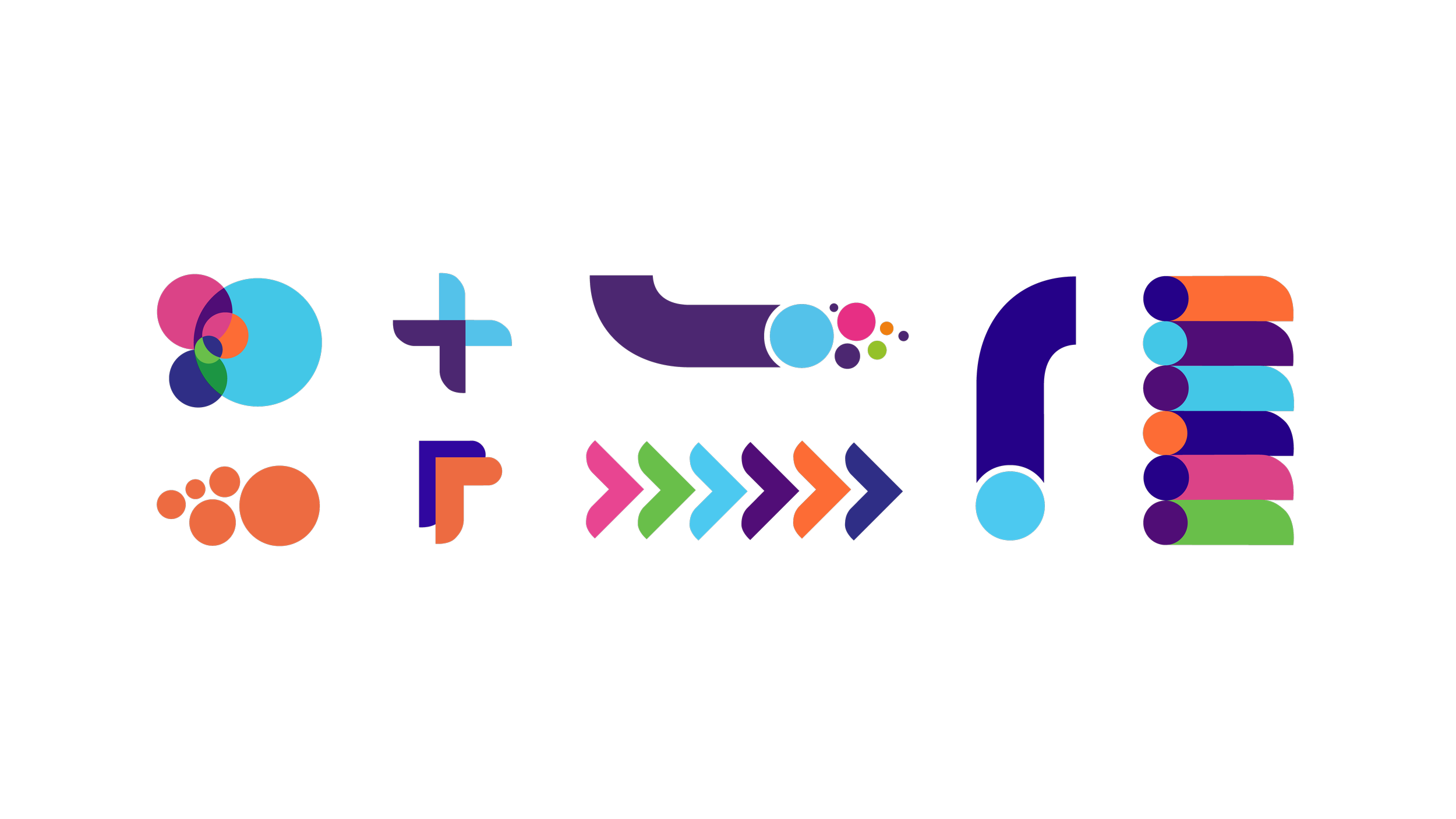
The logo and wordmark’s circular forms and rounded edges formed the foundation of the broader brand system, giving a friendly, approachable feel.
These characteristics extend into a custom visual language of plus signs, exclamation marks, arrows, and other graphic elements. Paired with vibrant, high-contrast colours, they bring a sense of energy, optimism, and momentum to the brand.
ART DIRECTION
Custom
Photography
Library
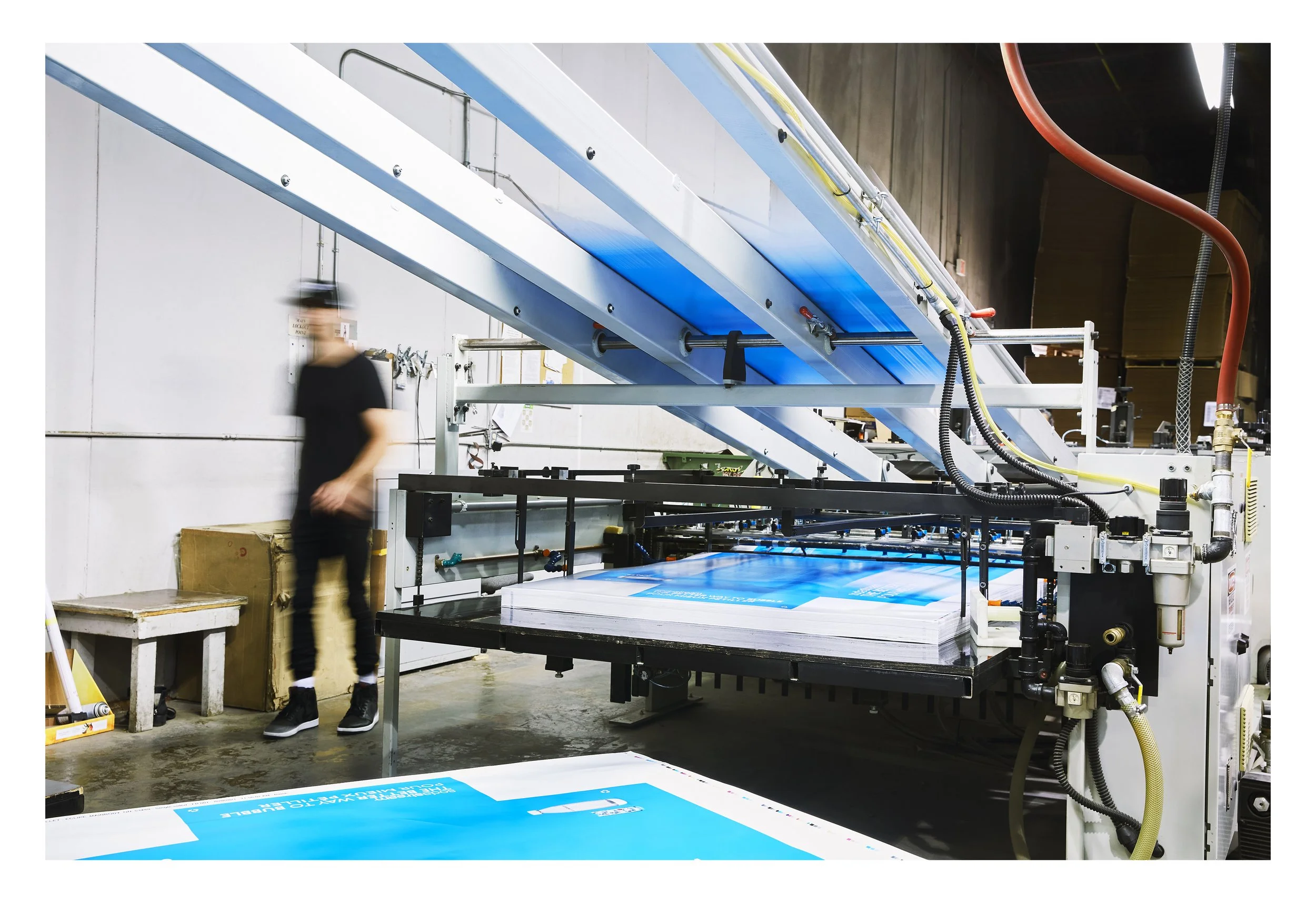
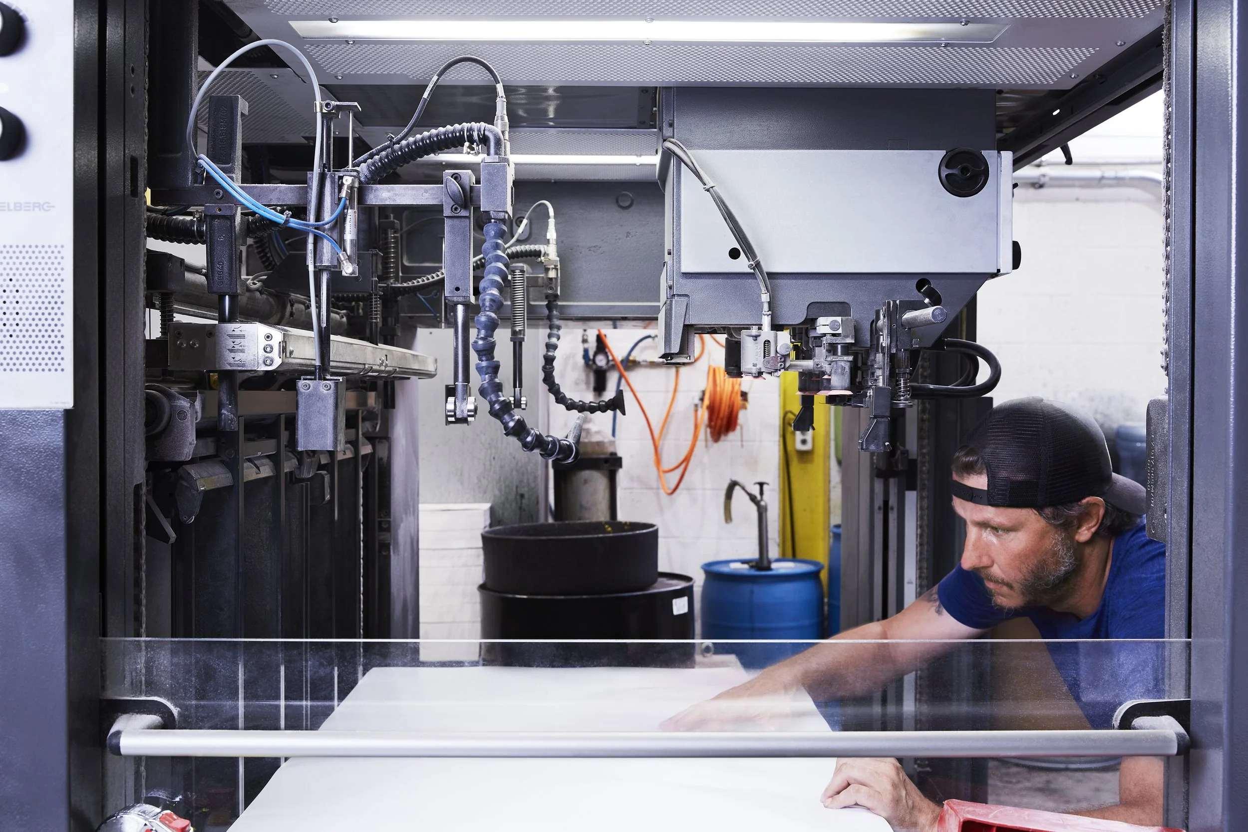
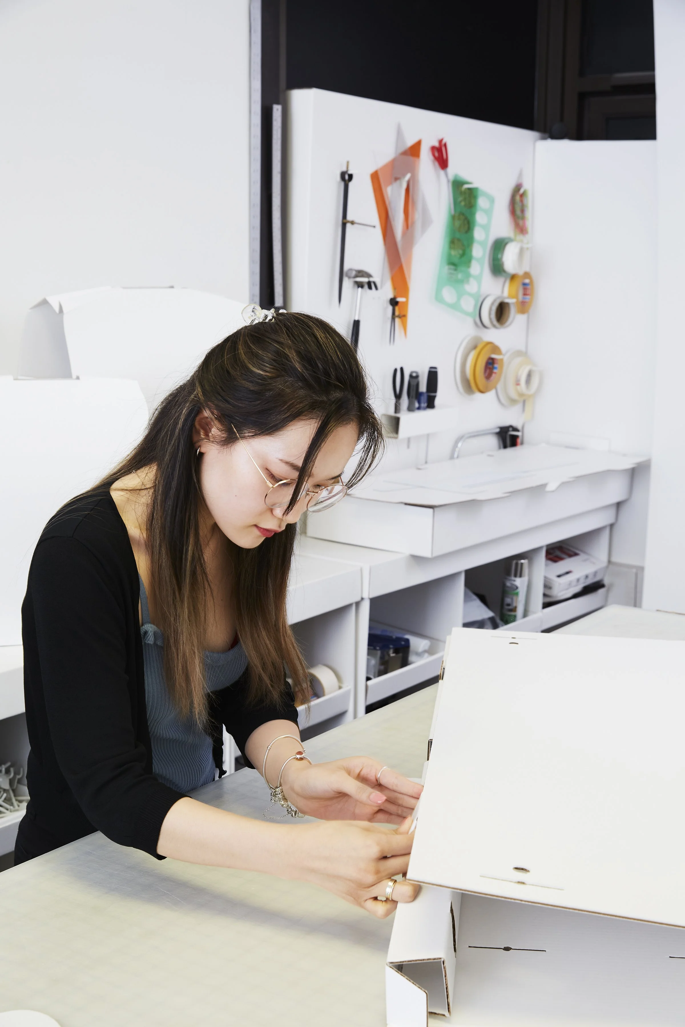
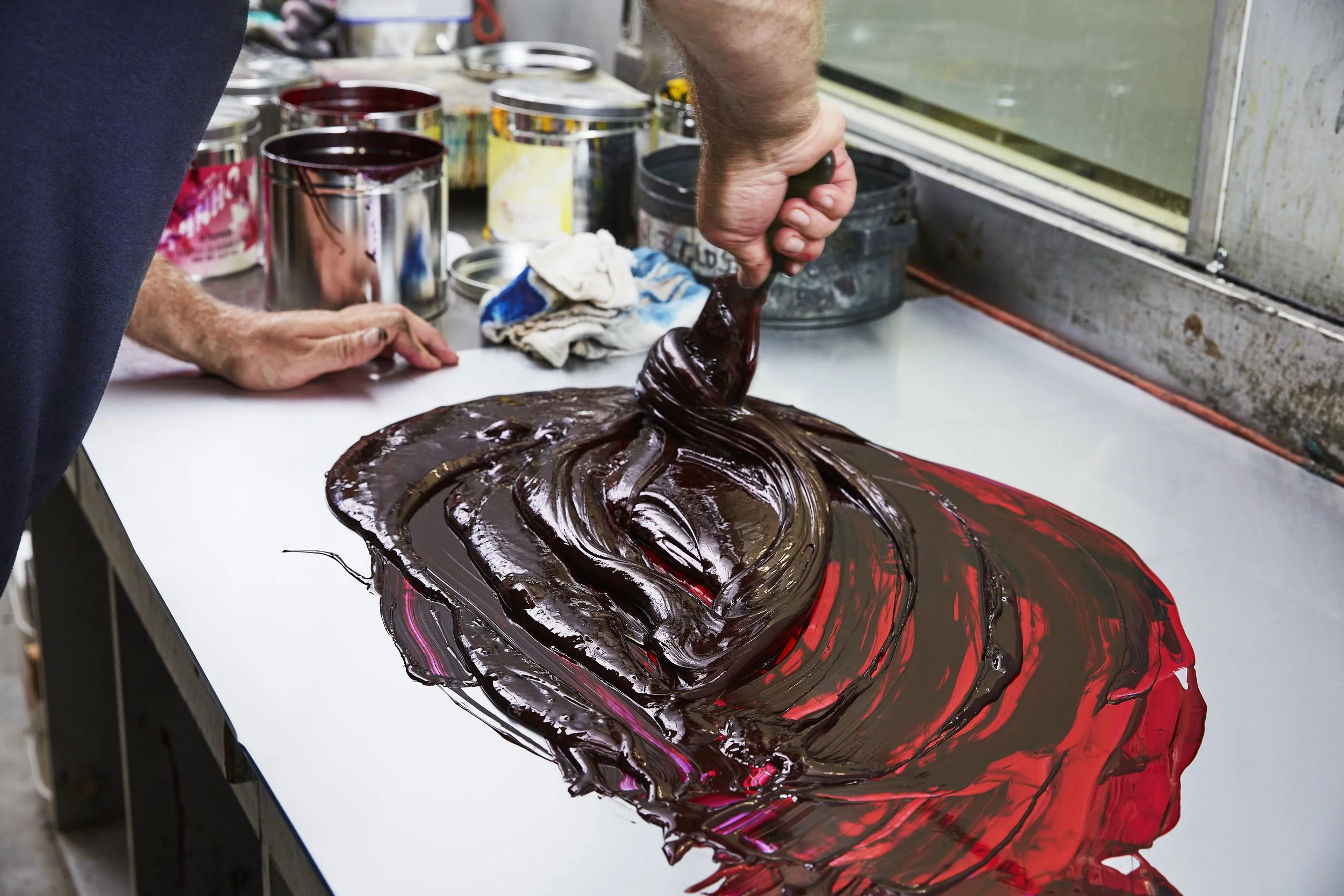
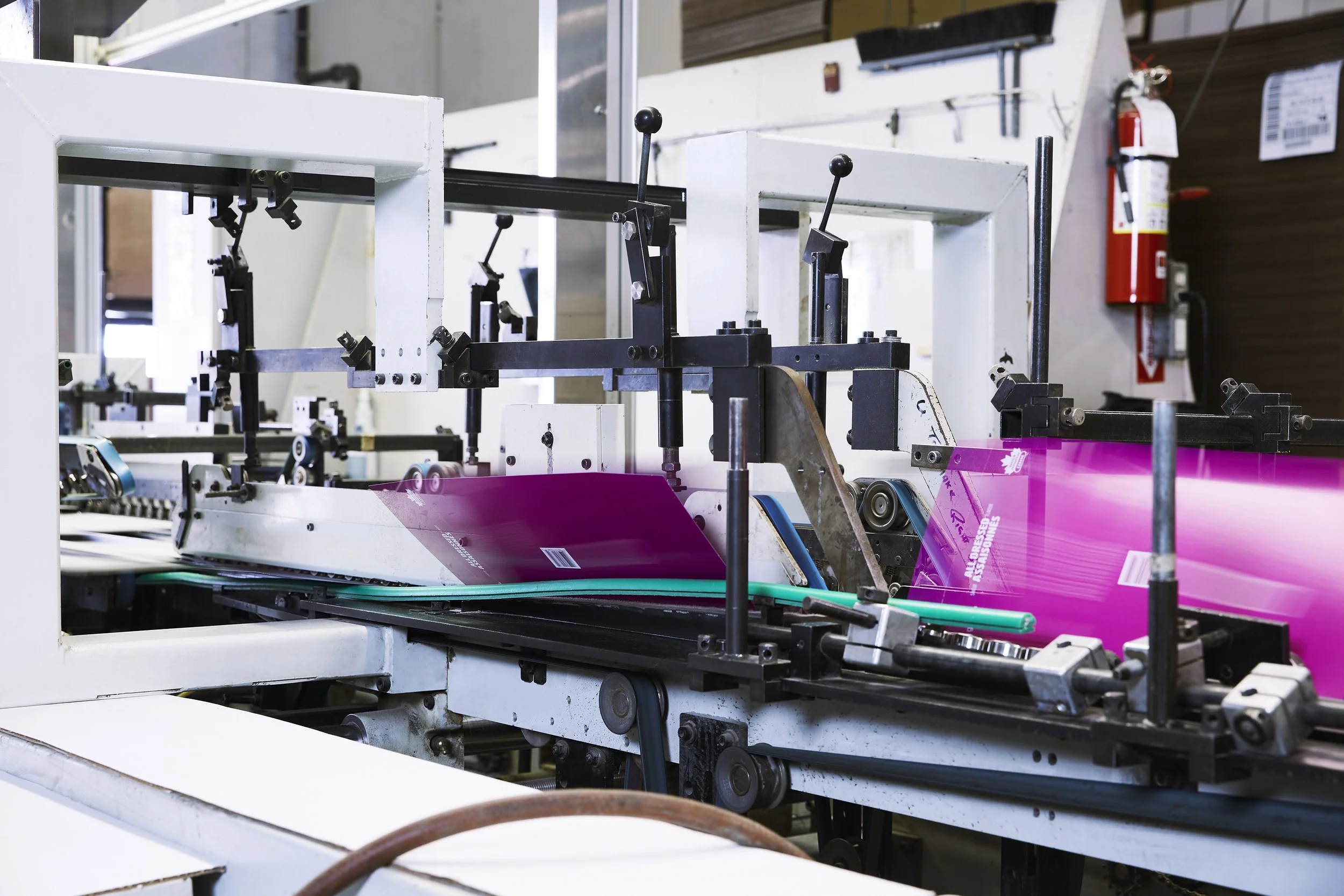
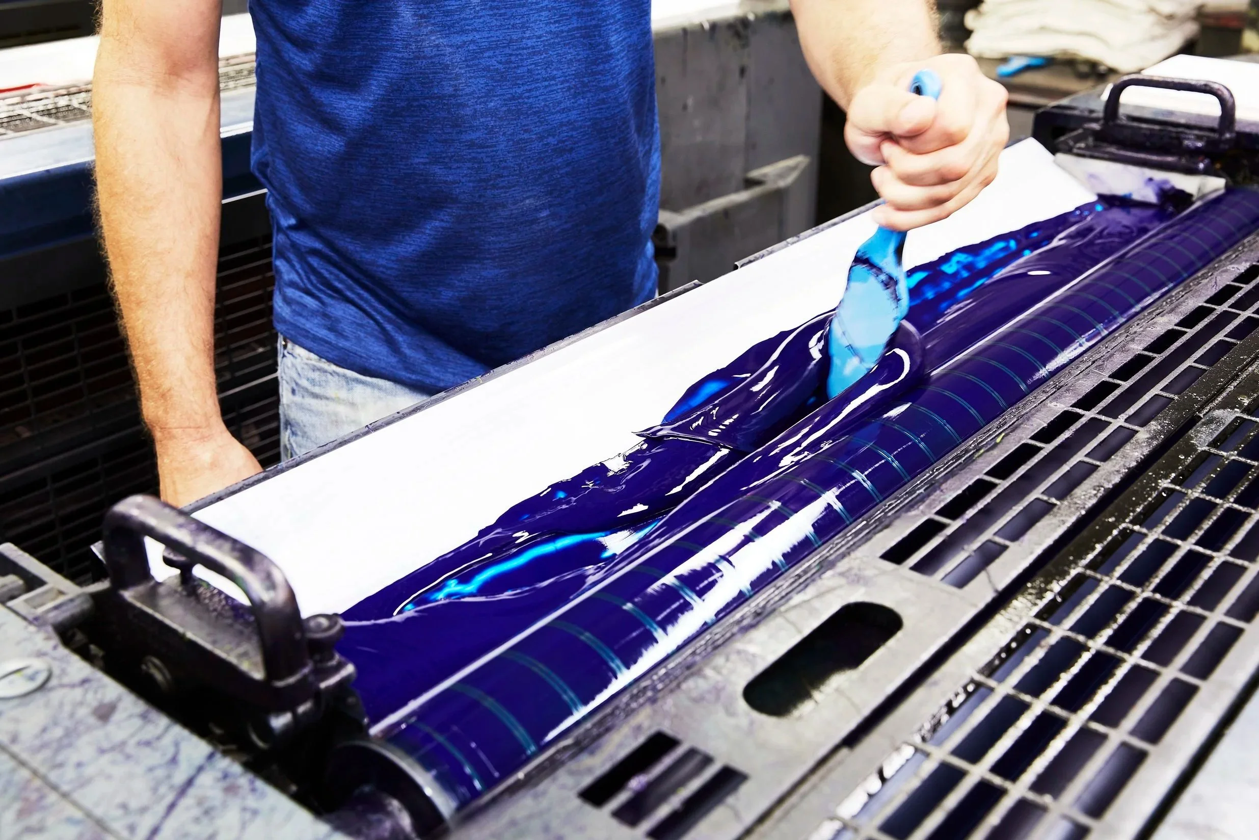
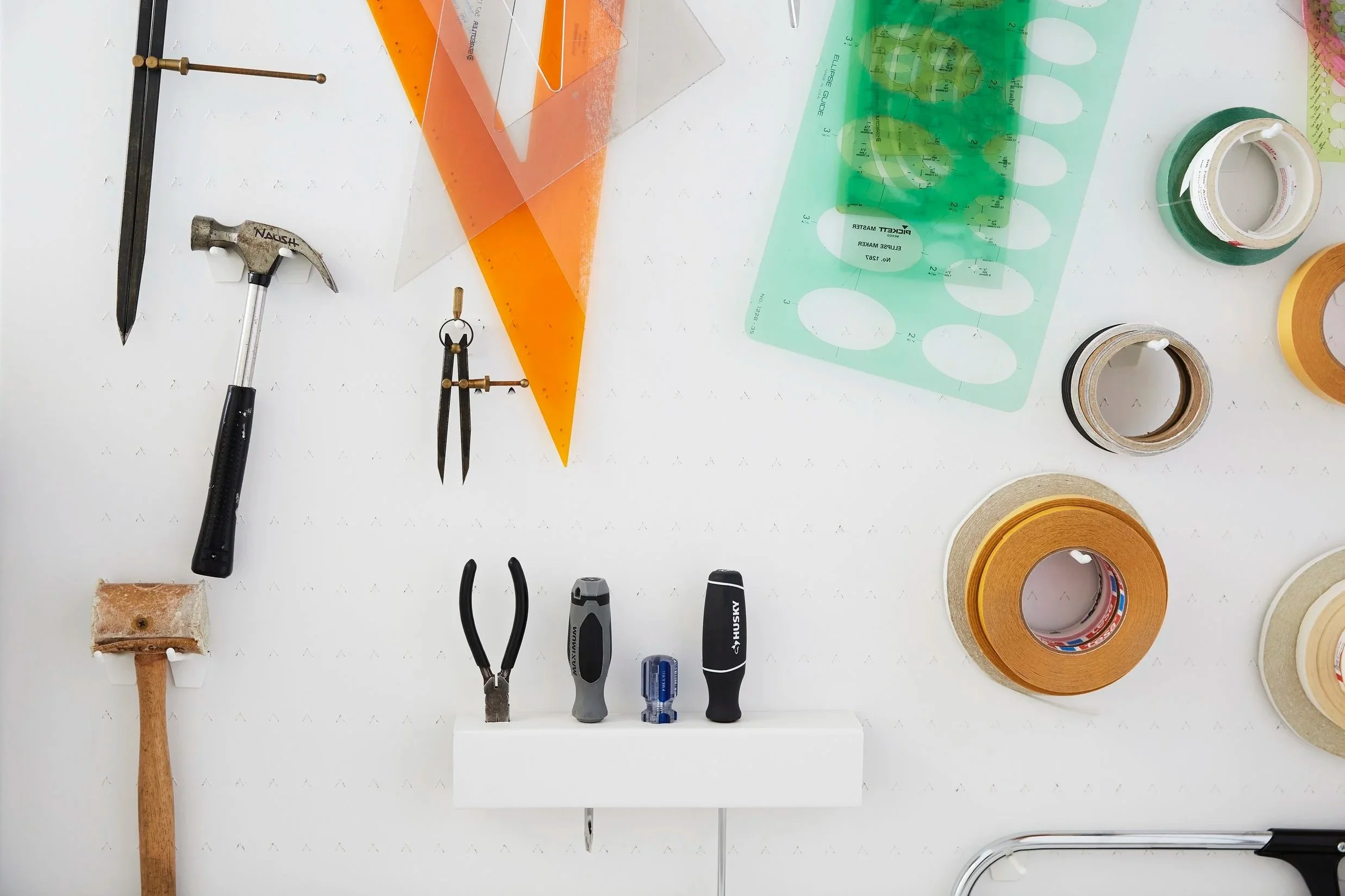
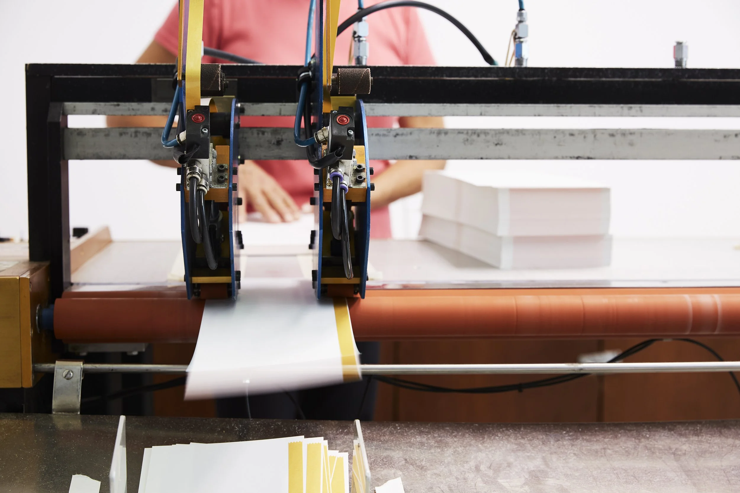
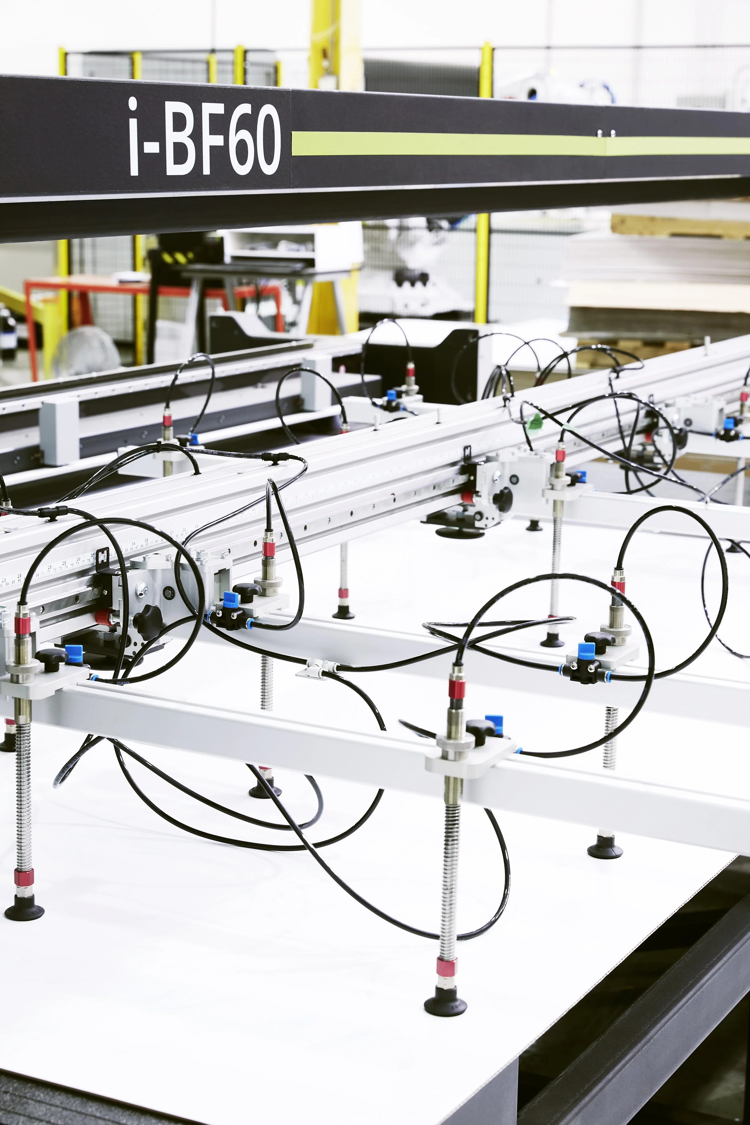
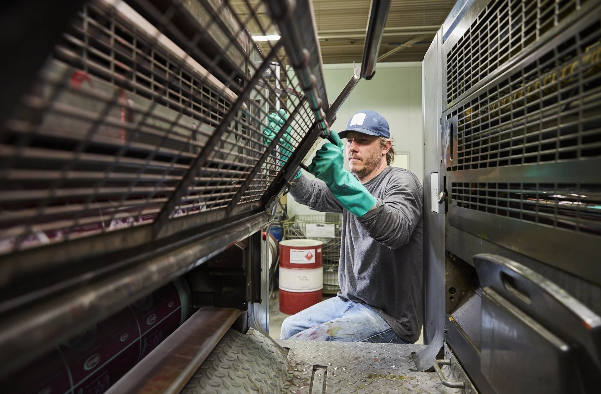
The new visual identity extended into a custom photography library, art directed to create a consistent, ownable visual language across brand communications.
Bold imagery captures the team in action, highlighting their tools and passion for their craft, while offering a glimpse into their day-to-day world.
Strategic colour accents reinforce brand recognition and add visual consistency.


Select Works
SPROUT
PIVT