
ROUTES AND ROOTS
CLIENT
Sprout Relocation
AGENCY
The Creative Collective
ROLE
Design Lead – Creative Direction and Design
SCOPE
Brand Strategy
Creative Direction
Visual Identity
Expression System
Brand Guidelines
Website Design
Social Media
Marketing Collateral
Presentation Design
Trade Booth Design
CONTEXT
Sprout is redefining global relocation, by putting people first—filling a gap in an industry that has traditionally put process over experience.
STRATEGY
Position Sprout as a category outlier by putting people—not process—at the center of every move.
SOLUTION
Humanize relocation services and bring big moves down to size by dramatizing two key elements: the routes people take to their new destination, and the roots they put down to build a new life.
VISUAL IDENTITY
A Budding
New Brand
System
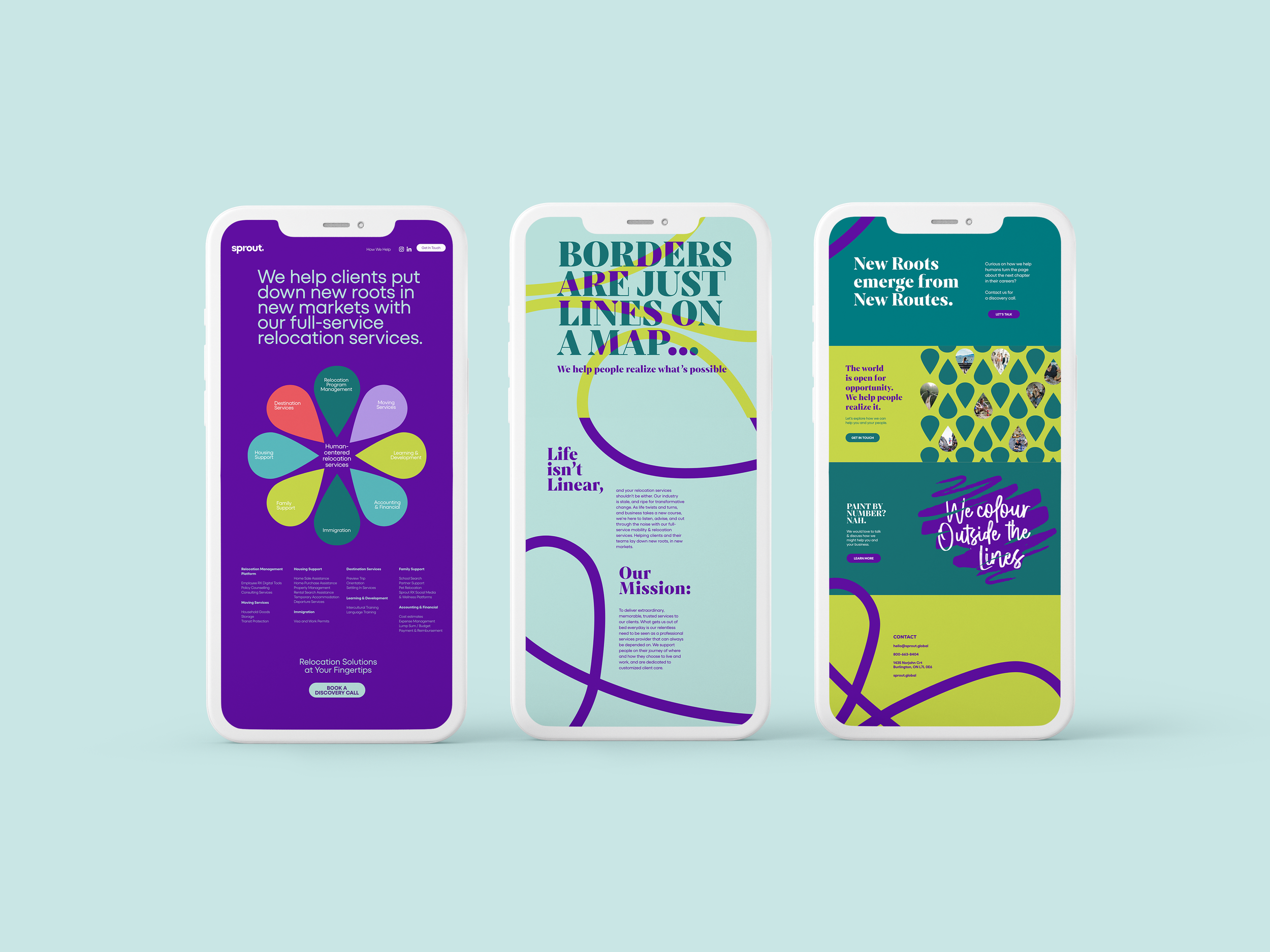
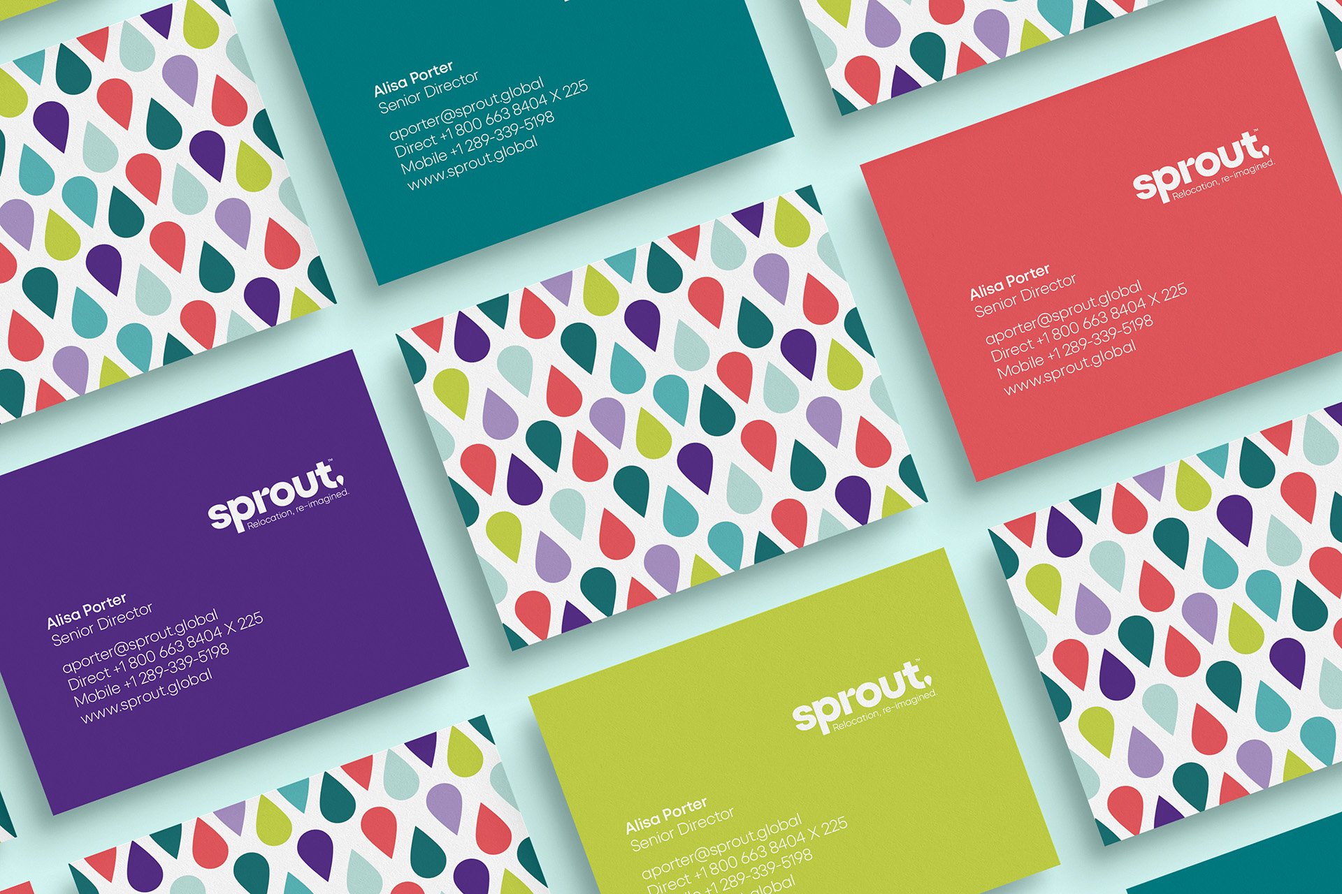
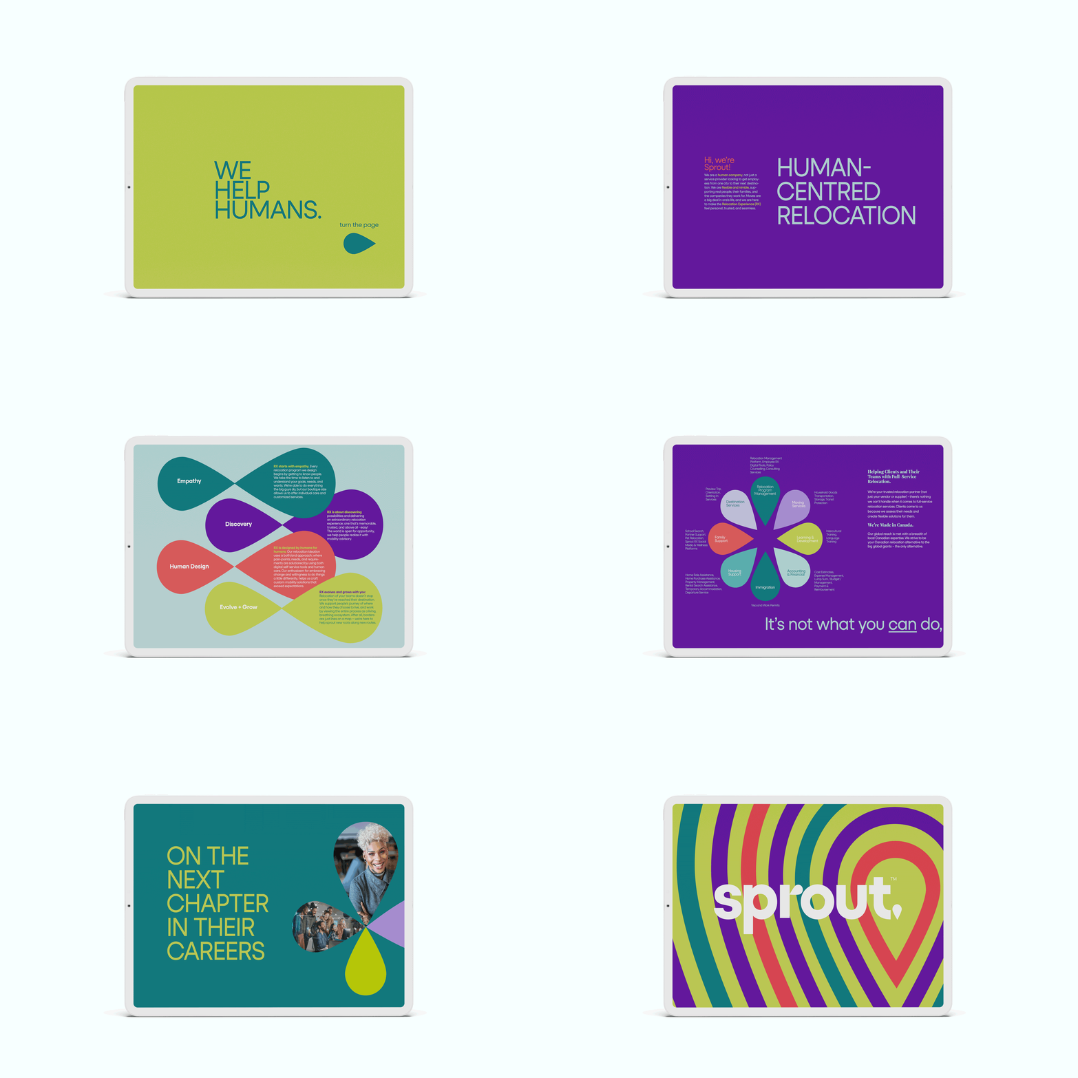
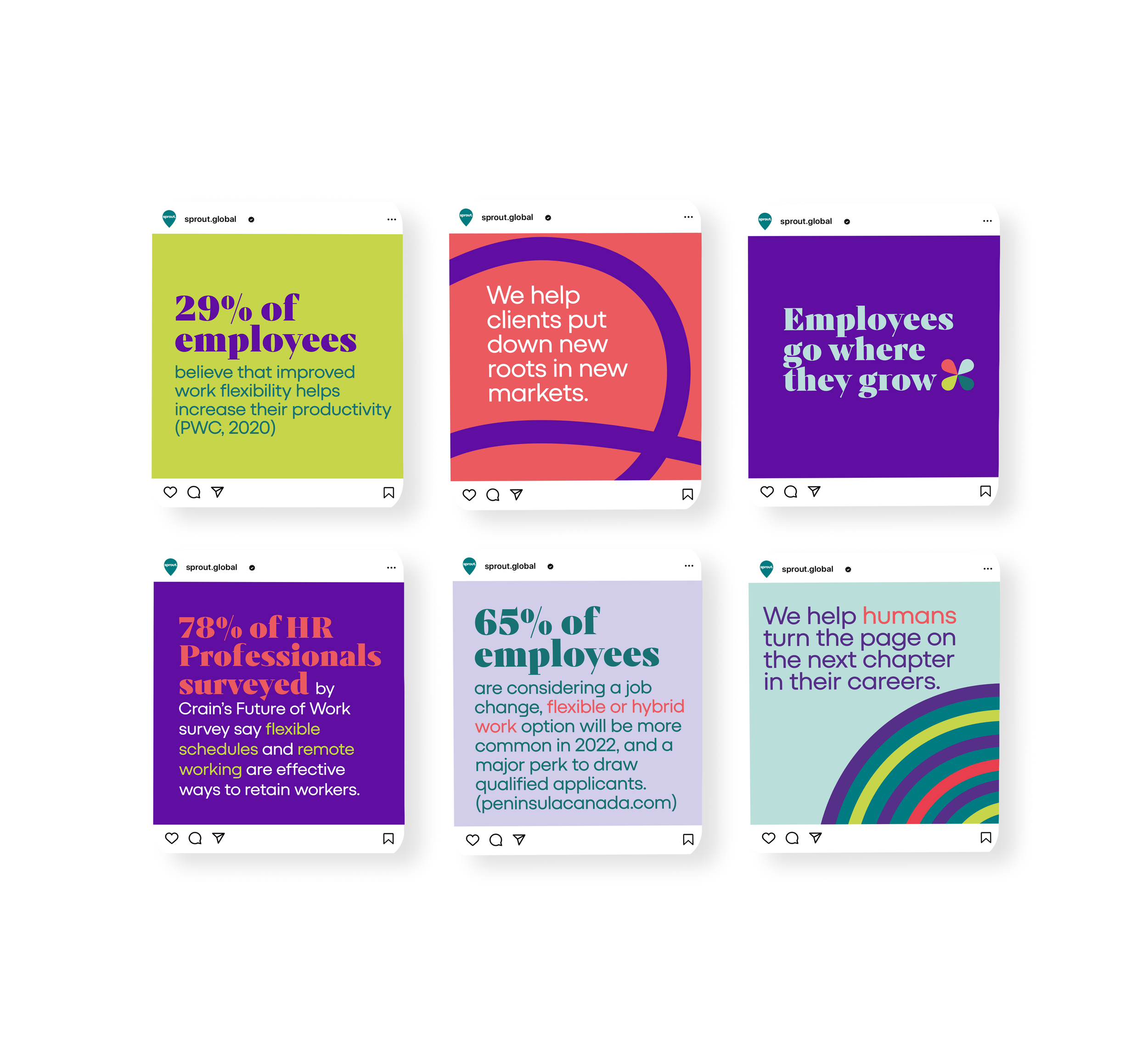
The logo’s flipped bud was an apt metaphor for their “rebel” positioning, and a witty nod to (re-)location. The custom-designed symbol, paired with curved, wandering lines, represents routes and roots: a new start in a new place.
The wordmark’s san-serif typography is modern, friendly, and playful—a departure from the conventional approach of competitors.
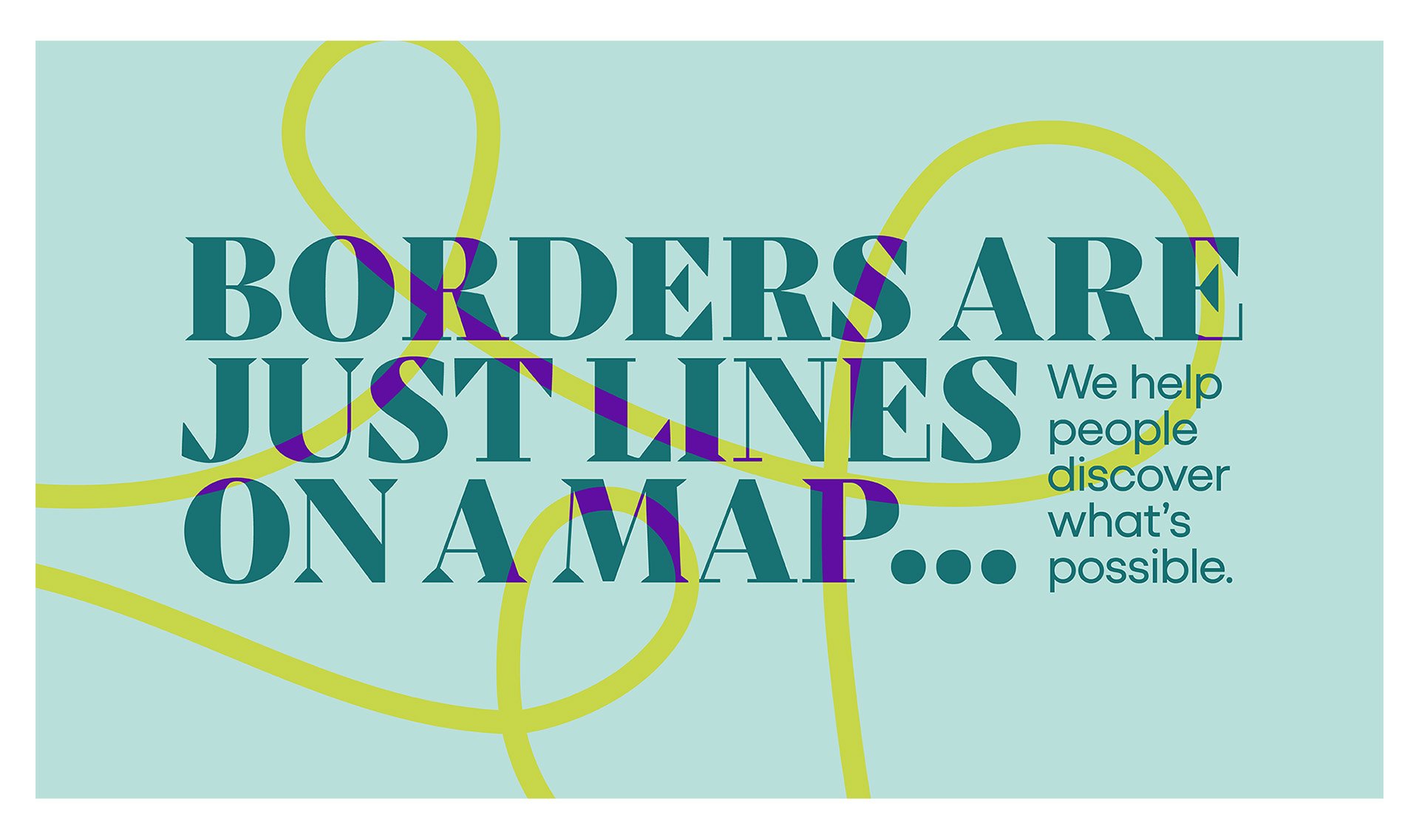
The custom-designed symbol, paired with curved, wandering lines, symbolizes routes and roots: a new start in a new place.
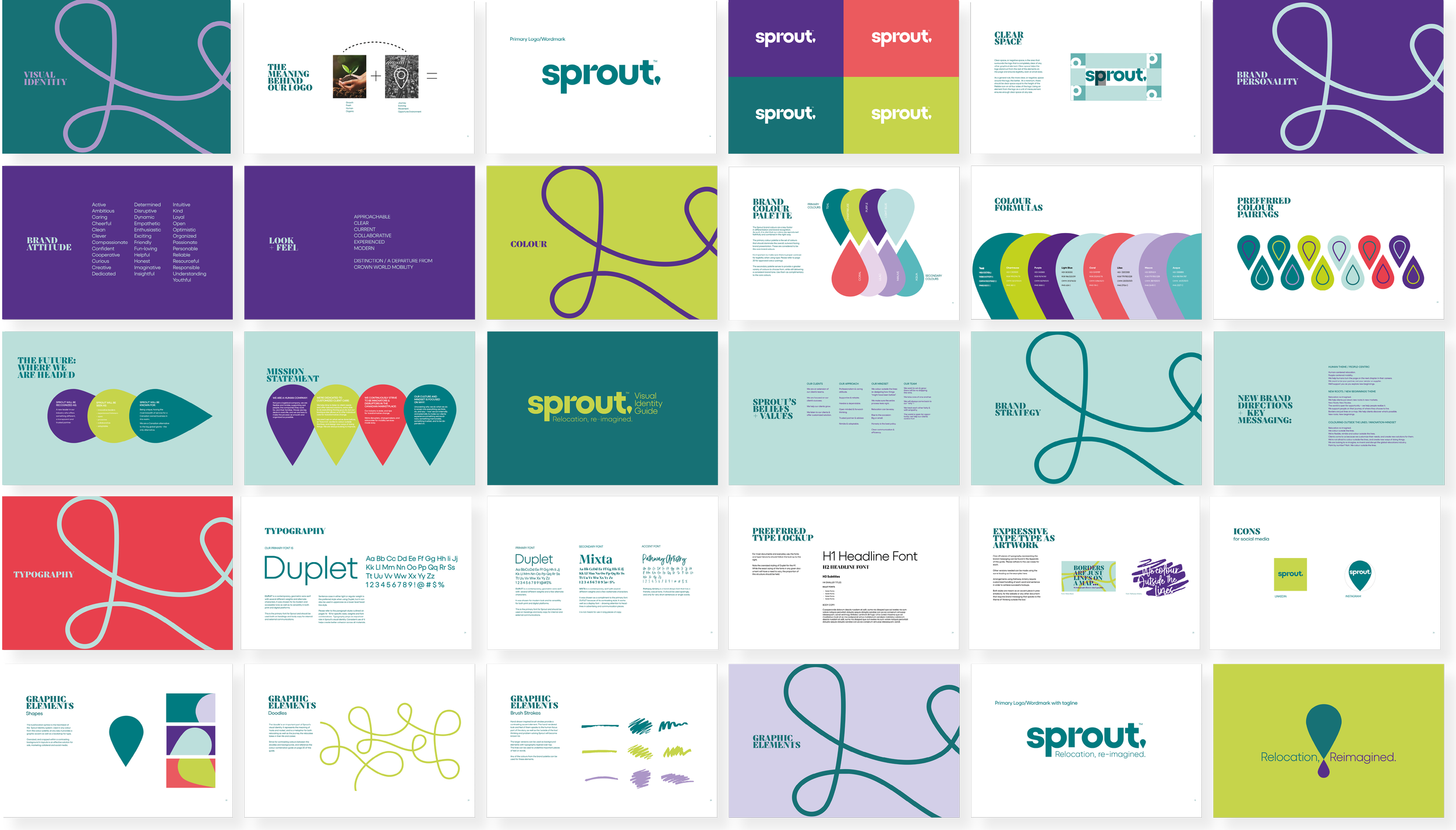
Chartreuse speaks to Sprout’s outlier positioning, while signalling the deeper meaning of making a life-changing move: rebirth, growth, and a metaphorical change of season.
Other Works
PROPRINT
PIVT